Best Practices for Using a Background Image for Website
Your background image for your website is not just something that looks good. It actually affects the entire user experience. It has the potential to become a powerful storytelling tool that can reel your audience in and entice them to stick around. This is why a lot goes into deciding on which web background image to use — be it a simple solid block color, an actual image, or even a video. Here’s a guide on the best practices when choosing website backgrounds to help you make the right choice.

Choosing the Right Image
Cool website backgrounds are designed to set the tone for your website content. They can be used to emphasize the text content and reinforce your site’s message. With that said, choosing the right image is important. For starters, you must be mindful of recommended website background sizes. A good rule of thumb is to go for the largest possible file but keep within the maximum recommended website background size so as to not slow down the site.
Stay away from busy images
When choosing website page background images, it’s important to go for photos that are not too busy. This is particularly important when adding text content over the image. You want to select a beautiful visual but it shouldn’t take away from the message of the text. For instance, landscapes with sufficient headspace can make a great web background image.

We also recommend going for more subdued colors or adjust the contrast on the web background image so it doesn’t overpower your text.
Where to source images
While it’s highly recommended that you invest in professional photography to create website background images, not everyone has the budget for such a service. There are a lot of places on the internet where you can source for free web backgrounds. Patternico has an integrated image library that offers a collection of free web patterns that will suit most websites. Royalty-free image websites like Unsplash are also great sources for free backgrounds.
When in doubt, use abstract images
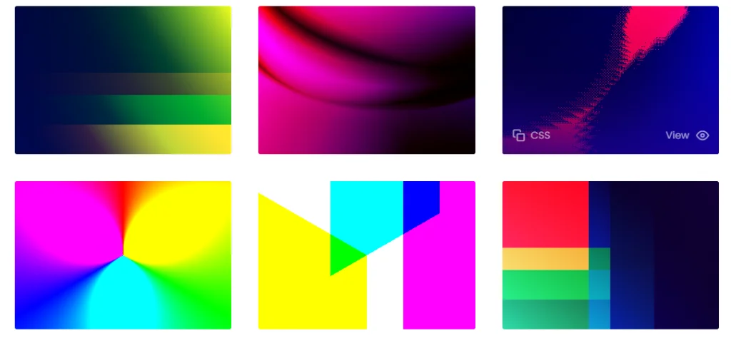
Abstract and gradient backgrounds are commonly used in modern website design as a way to make a minimalist layout look more punchy. When used against a lot of whitespace, it adds character to a website and makes it more engaging. The only thing about abstracts is that they only work with specific types of websites. Gradienta has a collection of gradients to use with your website.

Another option is to go for block colors against text instead of actual images. You will need to put a lot of work on creating attractive text content, however. But on the flip side, this means that you get more room to get your message across because the background doesn’t distract the user from what your text content is trying to say.
Use video backgrounds
Modern website design trends are now starting to embrace the use of video in place of image backgrounds. Videos are known to increase engagement because visitors are more drawn to them than still images. Use a video background introducing your brand or what your website is about. It can be the first thing that a user sees as soon as he lands on your site.
We are easily distracted by anything that moves – just like that dog that ignores everything in its world to chase that pesky little squirrel!
“Okay, you got me to look at your silly video, what does this have to do with my website design?”
What a great question and I’m glad you asked.
Video background on your website, if used properly, can help you capture your website visitors’ attention too!
Video background is one of the most popular website design trends that seems to be here to stay.
Marketers love video backgrounds because they make websites look modern and create a sense of artistry that static background images simply can’t match up to.
Many website conversion experts and regular people alike see their visitors stay on their websites longer and more likely to sign up or opt-in to their product/service offers.


